
Inspired by our colleague Tom’s recent article on LinkedIn, we thought we would take a look at brand simplification and the reasons for it.
As we’ll all be aware, over the past decade or so, there has been an increasing trend of brand simplification. Here are a few examples:
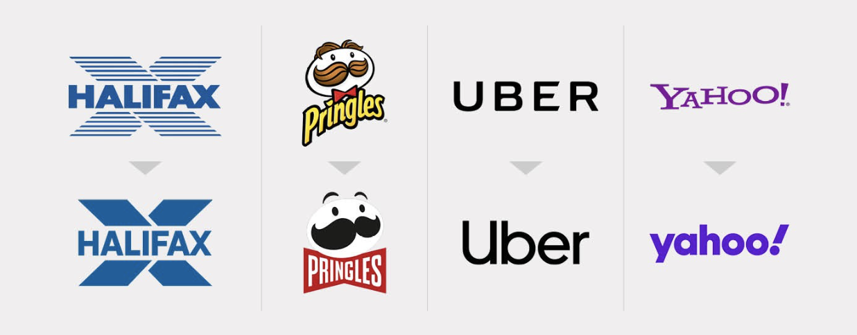
As design constantly evolves, it would be difficult to argue that the top row of logos looks better than the bottom. Yet it would be easy to argue that each of those has lost a bit of personality in the change; there are far more differences between each logo in the top row than the bottom row. These brands also occupy totally different sectors so why are they moving into looking similar; becoming homogenised? Surely brands desire salience to stand out from their competitors?
There are many reasons for this trend towards simplicity. Brands are constantly adapting to existing in an increasingly digital landscape. While colours can be more vibrant on RGB screens, space comes at an even bigger premium than in print, so a logo with more elements and more complex line-work won’t display as well as something simpler and more geometric. Apps are also increasingly prevalent and to fit with that format brands often have to strip back to mere iconography and lose the wordmark completely. Brands are also constantly fighting for time and space on social media, so naturally, a simpler logo which can be recognised in a tiny circle in your Facebook feed for instance, is highly desirable. Simpler logos can be more seamlessly incorporated into motion graphics.
It could be argued that with the advent of social media, tagging a brand or even directly speaking to them, has never been easier – a brand can easily garner a negative perception, whether it’s justified or not – so maybe it’s a trend of brands not wanting to stick their necks out for safety’s sake; to blend in rather than be individual.
Another reason could be designers ourselves: how we create logos has changed hugely over the years. At one time you had to be able to draw; it was a prerequisite. Now it couldn’t be easier within Adobe Creative Suite; it’s possible to quickly pick a font, browse some colour swatches, play about with some shapes in Illustrator and be done. Has the technology forced out a key creative approach to logo design? Is it easier and quicker to design a simple logo than a more complex one perhaps?
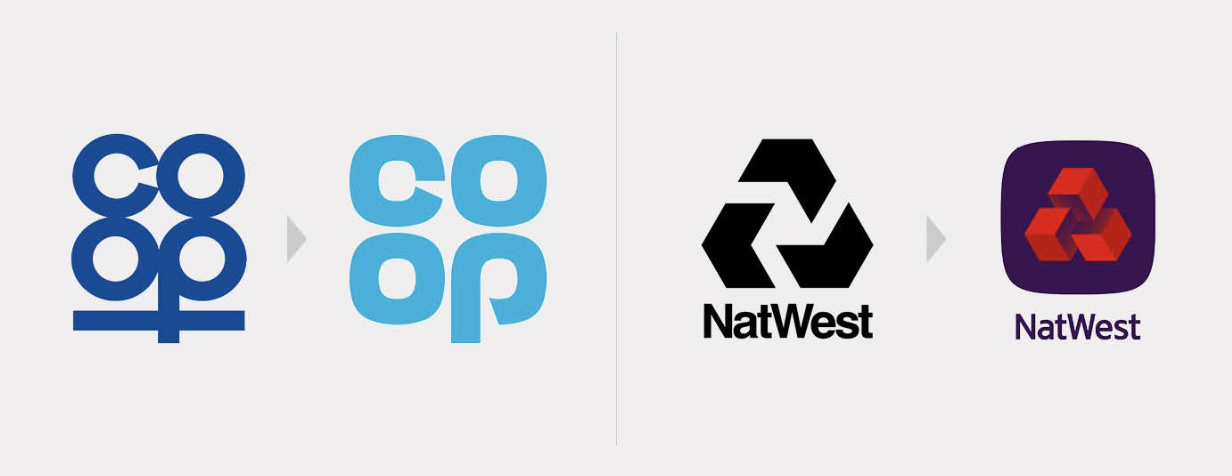
Despite the trend, examples do exist of brands reverting to older values and styles. These examples are slightly more involved and have more character than their original versions, it’s bold move and in my opinion, one which has paid off. Both examples retain the overall personality of the original yet bring them into a modern aesthetic while accentuate the key characteristics of what made them identifiable initially.
Naturally, there’s only so far you can take a trend of simplification so it’ll be interesting to see how branding and logo design evolves from this in the next decade. It’s always interesting looking back at things you thought were cutting-edge at the time and seeing them as horrendously outdated (Web 2.0 we’re looking at you!). There are always examples of logos and shapes which seem timeless (Nike Swoosh anyone?) but most designs fall into a zeitgeist so rebranding and refreshing is par-of-the-course.