Pilkington Family Trust
Brand development
The Pilkington Family Trust has been supporting generations since the 1920s offering a variety of activities from social support to financial help, gardening, care and other activities. We were honoured to have been commissioned to give their brand a fresh new look and update their website along the way. This rebrand is a testament to the Trust’s enduring commitment to its beneficiaries and its vision for the future.


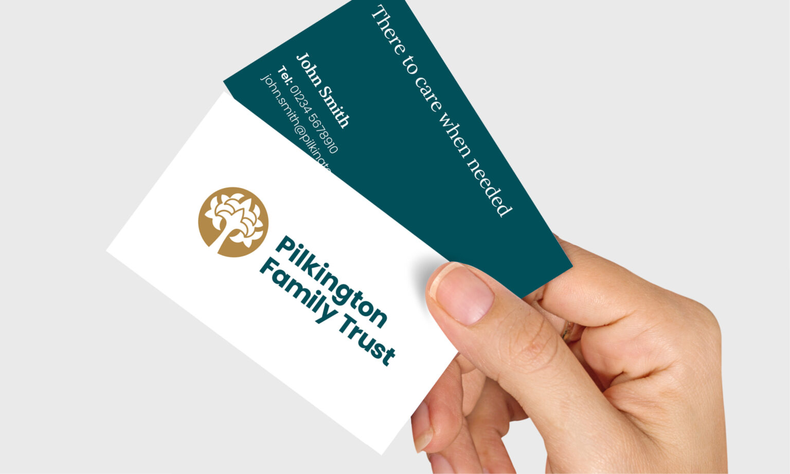
We have crafted a new visual language that captures the essence of the Trust’s rich history while embracing a contemporary aesthetic. Key elements of the rebrand included:
A revitalised logo: The iconic tree symbol, a cherished emblem of the Trust, has been modernised to reflect its ongoing evolution.
A refined colour palette: A sophisticated colour scheme has been selected to evoke feelings of trust, stability, and growth.
A versatile typography: Two fonts were chosen that are both clean and elegant to enhance readability and elevate the overall brand experience.
A refreshed website: A new, user-friendly website has been designed and built to deliver information clearly and effectively.
This rebrand signifies a new chapter for the Pilkington Family Trust. By adopting a fresh and dynamic visual identity, the Trust aims to strengthen brand recognition, enhance communication through improved clarity and impact of messaging.
As the Trust continues to adapt to the changing needs of the community, this rebrand positions it for continued success and impact. By updating their visual language, we’re helping the Pilkington Family Trust reach a wider audience and continue their mission of providing essential support to those in need.
See the Pilkington Family Trust website here.


