SQR Cut Cricket
Brand development
Creating a game-changing brand
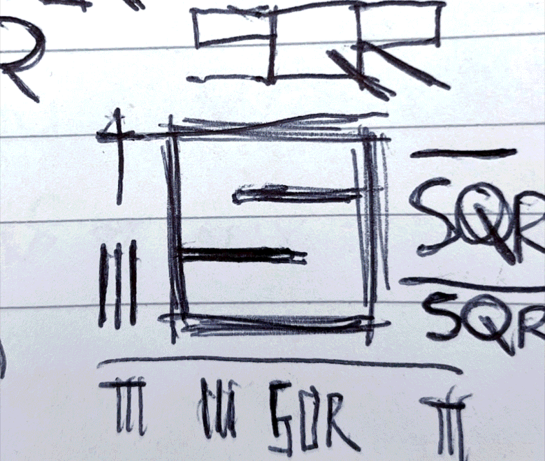
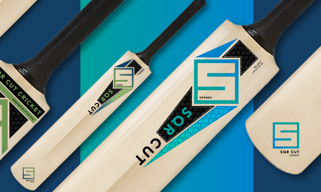
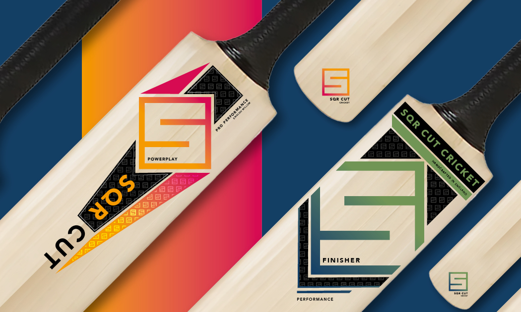
Launching a new brand in the world of cricket demands something bold, confident, and unmistakably individual. SQR Cut takes its name from square cut — one of the game’s most graceful and expansive shots. The abbreviated name gives the brand a modern edge, appealing across generations while confidently standing apart from more established cricket brands.
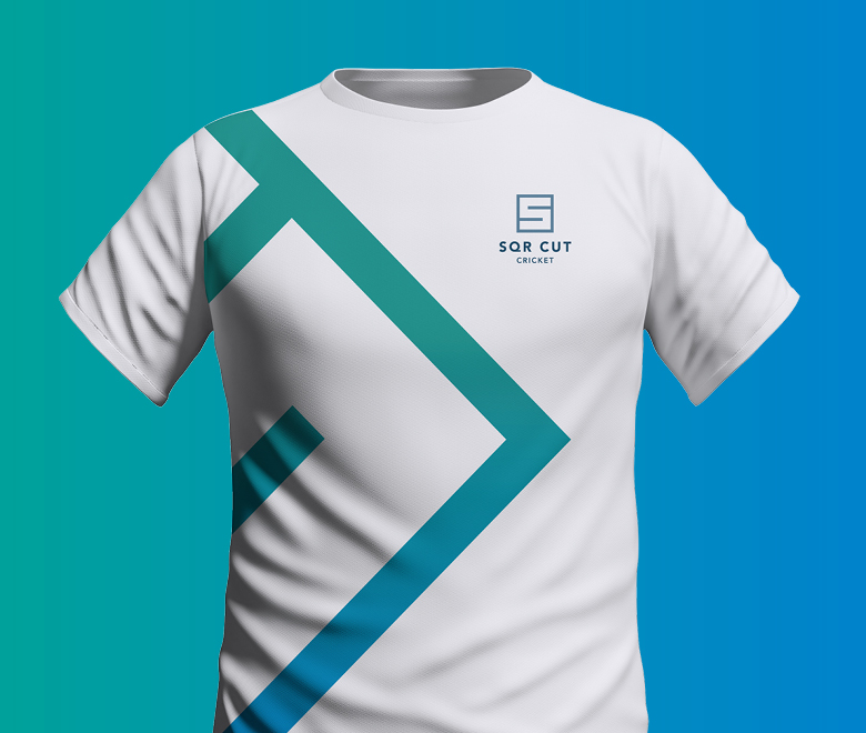
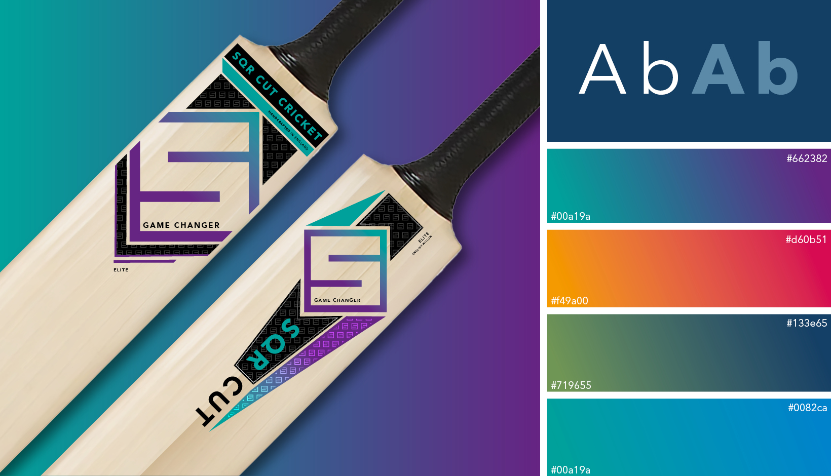
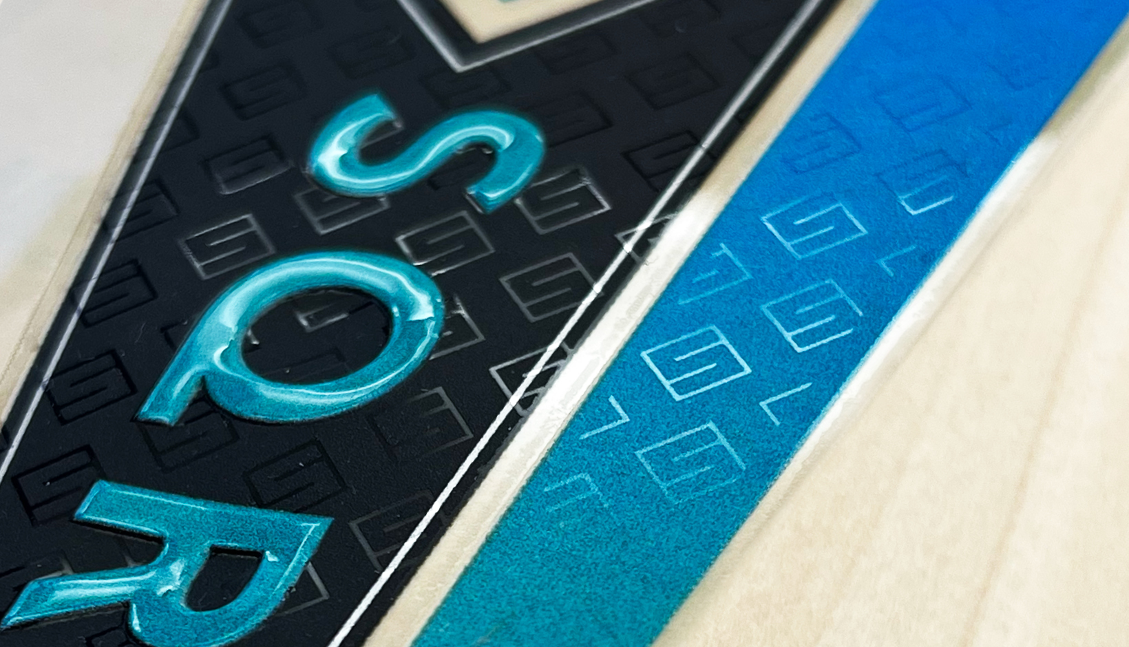
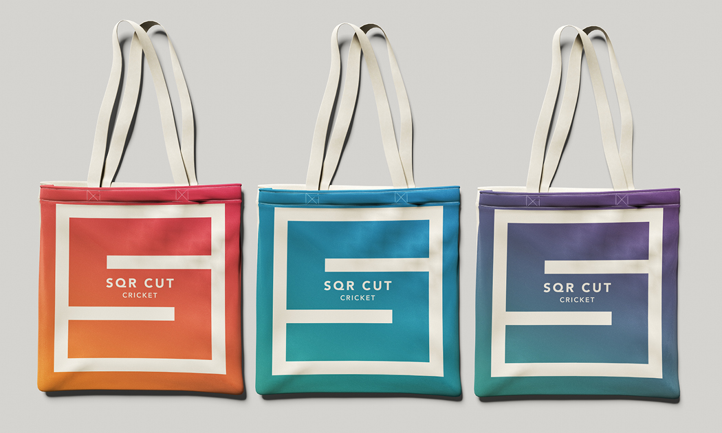
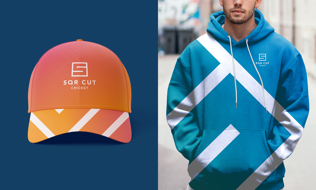
Visual identity & logo design: To reflect the brave, uncompromising nature of SQR Cut, we created a distinctive logo inspired by the vertical lines of cricket stumps and pads, all brought together within a square-formed letter S. Diagonal lines and angular shapes are used throughout the brand to convey movement, energy, and on-field intent.
Dynamic brand animation: To complete the identity, we brought the brand to life through a dynamic logo animation, designed to create impact and momentum across digital platforms.